Introduction
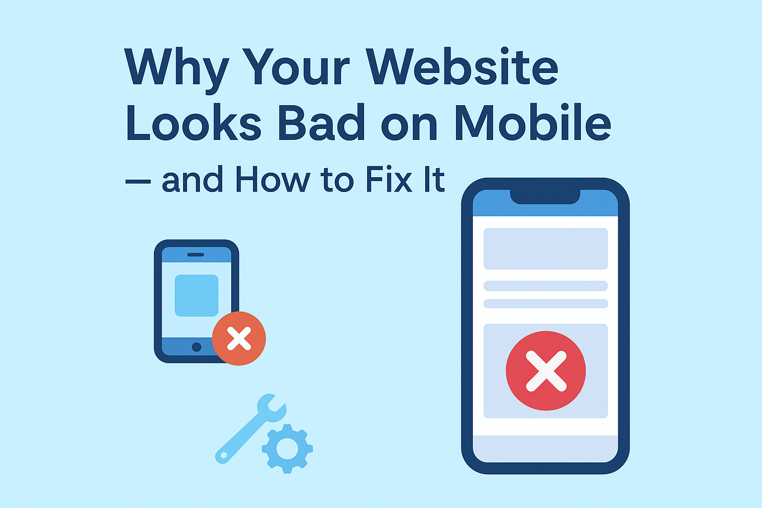
Let’s be real for a second:
If your website looks good on desktop but falls apart on mobile, you’re losing customers every single day.
Because 75% of users now browse the internet on their phone — not on a laptop.
When your site is hard to read, buttons are tiny, layout looks broken, or the page takes forever to load, people leave in seconds. And Google notices that.
Which means → lower rankings → fewer clicks → fewer leads → fewer sales.
But the good news?
This is one of the easiest website issues to fix — when you do it right.
Let’s break down why your website looks bad on mobile and how to fix it with clean, modern, 2025-ready design practices.
01: Your Website Isn’t Truly Responsive
Many websites claim to be “responsive,” but in reality, the layout is just shrinking, not adjusting.
Signs Your Site Isn’t Responsive:
Text becomes too small
Images go outside the screen
Buttons overlap
Navigation becomes messy
✅ Solution:
Use Mobile-First CSS, not Desktop-First.
If your developer didn’t build the site mobile-first, you’re already behind.
02: Your Images Are Too Big (Slowing Down Everything)
High-resolution images look good — but they wreck mobile performance.
Slow websites = high bounce rate = zero ranking growth.
✅ Fix:
Use Next-Gen formats (WebP) and lazy loading:
03: Your Text Is Too Small (Or Too Wide)
If your visitors need to zoom to read, you’ve lost them.
✅ Fix:
Base font size for mobile should be 16px to 18px
Line height should be 1.4 to 1.6
Small change = huge readability boost.
04: Your Buttons Are Not Thumb-Friendly
Your “Contact” button shouldn’t require surgical precision to tap.
✅ Mobile Button Rules:
| Element | Recommended Size |
|---|---|
| Button Height | 44px–52px |
| Button Width | Minimum 80px |
| Spacing Between Buttons | 8–12px |
Also — make your CTA sticky on mobile:
05: Your Header Menu Is a Disaster
If your menu turns into 14 dropdown items — visitors leave.
✅ Fix:
Use a clean mobile hamburger menu with only 4 primary links:
Home
Services
Portfolio / Work
Contact / Get Quote
06: Your Website Builder Might Be the Problem
Some themes drag heavy scripts and bloated code.
If you used:
Elementor + too many plugins
Old WordPress theme
Template from 2018
Your site is probably slow and non-responsive.
✅ Fix:
Switch to a lightweight, modern 2025 theme:
Astra
Blocksy
GeneratePress
Kadence
Or custom-built layout (best option for speed + SEO)
07: Your Site Was Never Tested on Real Devices
Most businesses only check their site on desktop and one phone.
✅ Use Testing Tools:
Chrome Developer Tools Mobile View
BrowserStack
Google PageSpeed Insights (Mobile Tab)
Do not guess — test and fix.
📌 The Harsh Truth
If your website looks bad on phones — it’s costing you money.
But you don’t need a full redesign.
You just need mobile-first adjustments — and we do this every day.
🚀 Want Us to Fix It for You?
We specialize in Responsive Web Design + Speed Optimization + Mobile UI/UX.
We will:
✅ Make your site fully mobile-friendly
✅ Improve speed & performance
✅ Improve user experience
✅ Boost your Google ranking